Netwave - ISP & City Portal
Contributions:
User Experience
UI Design
About the Project
Disclaimer
Because of non-disclosure agreements, I cannot go into full detail about this project online.
Feel free to contact me to learn more and chat.
The Netwave application was designed for a fiber network software solutions company to help users easily swap between ISPs (internet service providers. The portal also includes other services like health and education but our main focus was providing an experience for selecting a new ISP. The team’s goal was to design and update the implementation for a legacy product that needed a new look and feel with a better user experience.
Main focuses from a UX standpoint:
Research & Planning: Working with the client, we fully reviewed their current system, mapped out its current structure, and from the requirements mapped a new application architecture that provided an easy flow for users from many technological backgrounds. From a visual standpoint, in this phase, we also provided some options for interface direction to see how they wanted their product to be elevated.
Design: After gathering requirements and reviewing the current application, we moved into the design phase based on our pre-established use case flows. While updating the user interface to appear more modern and clean, we also wanted to provide a clean-cut subscription flow that helped guide the user.
Research & Planning
When starting this project, mapping the current application and account structure was required to update the overall user experience. Alongside this, we also had to fully understand how the porting to the user’s routers would work from a back-end and front-end perspective.
Map out current application architecture and provide suggestions for improvements.
Gathered information on how users would experience the subscription flow depending on their equipment.
Uncover use cases & personas to inform the level of complexity.
Plan out account structures.
Layout user and informational flows that would help inform content within the application.
Legacy Application Mapping
Starting, we worked with the client through demos of their current system in order to understand the current architecture of their product. Along with this, we also mapped out how the fiber system worked with their controllers and routers.


Updated Architecture/Flow
After reviewing what was currently there, we nailed down what items would be required to show for the updated portal and provided suggestions to improve user experience.


Account Structure
Since equipment was involved, we also needed to establish how the routers would interact with the user’s account and internet services.
User Personas
When establishing our users with the client, three main cases were highlighted and helped to inform our main flows:
User without port access and do not understand their equipment. (Most common use case).
User with port access but also do not understand their equipment.
User with port access and does understand their equipment (technically proficient).


Use Case Flows
After establishing our users, we also mapped out the general flows that needed to be showcased. These included adding a service, a end-to-end subscription flow, and a login flow.
Design
Once the research and planning phases were completed, it was time to tackle the design to be handed over to development.
Through an iterative design process and weekly meetings with stakeholders, design deliverables were created that focused on four main points:
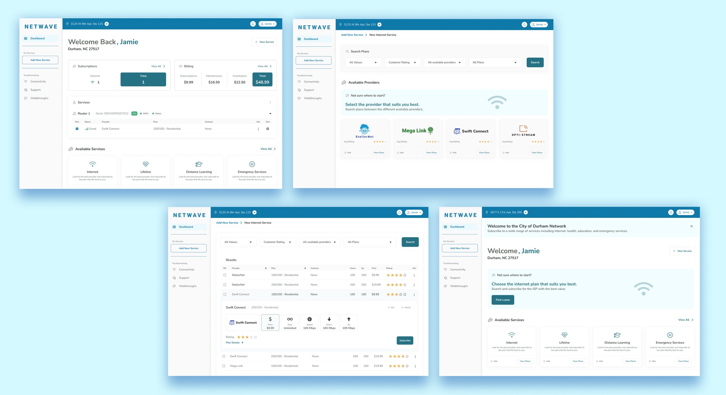
Overview Dashboard: Here users can view all of their service details and also navigate to adding new services. A subscription and billing breakdown is provided at the top of the screen for an at-a-glance view of their account.
New Internet Service: Users can filter by price, customer rating, available providers, and plan types to find the perfect plan for them. They can also navigate to a specific provider if they already have them in mind.
Provider Search Results: In this table view, users can view plan details in an easily scannable expanded view.
Compare Plans: Before proceeding with a subscription, plans can be compared against each other to narrow down the best plan available.
Dashboard with Services
Adding New Internet Service
Internet Service Search Results
Service Comparison View
Outcomes
Planning and designs delivered after iterative design process (6-8 weeks).
Providing a clear-cut user experience with an updated look and feel.
Figma prototypes and components delivered for development team implementation.
Future room for scaling portal to include other services than internet providers.


